10,000 search results
(0.026 seconds)
- Bernhard Modern by Bitstream,
$29.99Bernhard Modern was designed in 1937 by Lucian Bernhard for ATF. It is his personal version of the small x-height engravers’ old styles popular at the time. A perennial best-seller, Bernhard Modern remains popular in a wide variety of design and typesetting uses more that 60 years after its initial release. Bitstream’s version offers a wide array of typographer sets, including alternates, extensions, small caps and italic swashes. - Bernhard Modern by Linotype,
$29.99 - Bernhard Modern by URW Type Foundry,
$35.99 Bernhard Modern was designed by Lucian Bernhard and was first cut by American Type Founders. Bernhard Modern is an unusual face with small lowercase but very tall ascenders and short descenders. Bernhard Modern was intended to hold its color and contrast without depending on the spread of ink of the letterpress method. It has an attractive pen drawn quality which has made it a popular choice for invitations and greetings cards. The Bernhard Modern font is useful for advertising and display work.
 - Bernhard Modern by Image Club,
$29.99 - Bernhard Modern SB by Scangraphic Digital Type Collection,
$26.00Since the release of these fonts most typefaces in the Scangraphic Type Collection appear in two versions. One is designed specifically for headline typesetting (SH: Scangraphic Headline Types) and one specifically for text typesetting (SB Scangraphic Bodytypes). The most obvious differentiation can be found in the spacing. That of the Bodytypes is adjusted for readability. That of the Headline Types is decidedly more narrow in order to do justice to the requirements of headline typesetting. The kerning tables, as well, have been individualized for each of these type varieties. In addition to the adjustment of spacing, there are also adjustments in the design. For the Bodytypes, fine spaces were created which prevented the smear effect on acute angles in small typesizes. For a number of Bodytypes, hairlines and serifs were thickened or the whole typeface was adjusted to meet the optical requirements for setting type in small sizes. For the German lower-case diacritical marks, all Headline Types complements contain alternative integrated accents which allow the compact setting of lower-case headlines. - Bernhard Modern EF by Elsner+Flake,
$35.00 - Bernhard by ParaType,
$30.00 The typeface was designed at ParaType (ParaGraph) in 1993 (by Tatiana Lyskova). Based on Bernhard Condensed typeface of the Bauer company, 1912 by Lucian Bernhard). For use in advertising and display typography.
 - Bernhard by Linotype,
$29.99 The German typeface artist Lucian Bernhard designed Bernhard Antiqua as the first of his many text typefaces. The first weights were produced in 1912 by the foundry Flinsch in Frankfurt am Main. Further weights followed in the 1920s, produced by the Bauersche foundry, which had acquired Flinsch in the meantime. Bernhard font is an alphabet with a marked historical influence. It brings the viewer back to the early 20th century, when the bold forms of this typeface graced advertising displays and posters. Distinguishing characteristics of this typeface are the cross of the capital W and the rounding of the capital R. Linotype's Bernhard condensed bold, with its narrow, robust forms, is best for headlines in medium and larger point sizes.
 - Modern Modern by Protimient,
$14.00 - BERNARD - Personal use only

- Benhard by Holis.Mjd,
$14.00 BENHARD is a display font with masculine characteristics suitable for old or modern styles, this font can be combined with a sans-serif font suitable for poster fonts, logos, headlines, titles on book covers, films, content and others.
 - Moderns by ITC,
$29.99 - Bernhard Fashion by URW Type Foundry,
$35.99 Bernhard Fashion is a fine line sans serif typeface designed by Lucian Bernhard in 1929. Use the Bernhard Fashion font for posters, book covers, promotional material and packaging.
 - Bernhard Fashion by Monotype,
$40.99The German-born designer Lucian Bernhard designed Bernhard Fashion in 1929. An American" typeface, Bernhard's original design was created for the American Type Founders (ATF). It bespeaks the spirit of the roaring 20s. The hairline-thin letters exhibit elongated ascenders (but not descenders), and many stylized elements. The capital letters also all descend visibly below the baseline. In text, the extra large capitals seem almost like drop caps. This typeface is best used sparingly in text. Largely set headlines will allow readers to enjoy the fashionable quality of Bernhard Fashion's design." - Bernhard Tango by Bitstream,
$29.99An elegant and disciplined script popular for fifty years. - Bernhard Fashion by Tilde,
$39.75 - Bernhard Antique by URW Type Foundry,
$35.99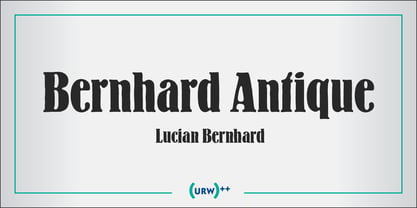
- Bernhard Tango by Tilde,
$39.75 - Bernhard Gothic by URW Type Foundry,
$35.99 Original design by Lucian Bernhard
 - Bernhard Fashion by Bitstream,
$29.99 This is an American face designed by Lucian Bernhard for ATF in 1929. An extra light face with tall ascenders and stylized bars that extend off to the left. The lower-case sits on the baseline and the much-taller-than-normal capitals have an imaginary baseline that sits about two-thirds of the distance from the real baseline to the bottom of the EM.
 - Bernhard Cursive by RMU,
$25.00 Bernhard Cursive ExtraBold is one of Lucian Bernhard's most expressive fonts which are worth to get preserved for now and times to come. An ideal font face for advertisements, posters, flyers, titles and subtitles.
 - Bernhard Script by profonts,
$41.99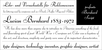
- Bernhard Signature by Jonahfonts,
$40.00I started to work at the Bernhard Studio in 1952 to 1959 in New York. I helped with some type designs and many other projects, this two tiered signature was added on all of Bernhard’s art that was produced in the past and in his later years. In the 50’s I thought Bernhard’s Gothic face was quite a bit outdated but as you may know it has become one of todays most used faces. His signature is based on his Bernhard Gothic Font. With todays computer technology I have digitized the caps and added lower case glyphs with lower ascenders and other slight changes. - Bernhard Blackletter by RMU,
$25.00 Bernhard Blackletter can be compared to a tuba, adding its deep bass sound to the orchestra of blackletter fonts. This font contains a bunch of useful ligatures, and to access all, it is recommended to activate both Standard and Discretionary Ligatures. You find the round s on the # key, and typing the combination N-o-period and activating the OT feature Ordinals gets you the numero sign.
 - Bernardo by Intellecta Design,
$18.90Bernardo is a fancy revival of a classic work of Lucian Berhard - HU Milksherbet by Heummdesign,
$15.00 This typeface was inspired by milk sherbet, which is enjoyed cold on a hot summer day. Rounded shapes and soft stroke endings make the typeface look cute. Heavy works great for headlines with its extra-heavy stroke weight and size, while Regular and Light are best for body text.
 - HU Cookie by Heummdesign,
$15.00 English HU Cookie is a cute handwritten typeface that can be used to express any lively or active moment. The alphabets are not aligned or evenly written but are crooked like scribble, which gives you funny and informal vibe. There are 2 weights of HU Cookie : light, semi bold Greek Το HU Cookie είναι μια χαριτωμένη χειρόγραφη γραμματοσειρά που μπορεί να χρησιμοποιηθεί για να εκφράσει οποιαδήποτε ζωντανή ή ενεργή στιγμή. Τα αλφάβητα δεν είναι ευθυγραμμισμένα ή ομοιόμορφα γραμμένα, αλλά είναι στραμμένα σαν σκαρίφημα, κάτι που σας δίνει αστεία και ανεπίσημη ατμόσφαιρα. Υπάρχουν 2 βάρη του HU Cookie: light, semi bold Cyrillic HU Cookie - это симпатичный рукописный шрифт, которым можно обозначить любой живой или активный момент. Алфавиты не выровнены и написаны неравномерно, они изогнуты, как каракули, что создает забавную и неформальную атмосферу. HU Cookie имеет 2 толщины: light, semi bold
 - HU Handwrite by Heummdesign,
$15.00 It is a handwriting-style font for body text that emphasizes gentleness and solidity by using less curvature and making use of a straight feel. The handwriting feeling is emphasized through the style that makes use of the natural bending and stroke order. Softness was added in the shape of a gentle curve, and perspective was applied by setting a vanishing point in the lower left corner.
 - HU Blackout by Heummdesign,
$15.00 HU Blackout is a typeface for titles that feels like letters are trapped in a square and has a constant and very narrow inner space. It is composed of three types of family typeface to increase usability.
 - HU Roundsans by Heummdesign,
$280.00 HURoundsans is a geometric sans serif variable typeface with matching italics. It has a variable width that adapts to your needs, pushing for maximum readability. Useful for any quirky display uses. Variable is very versatile and can be used in print or on-screen environments. It's perfect for logos, posters, titling, UI/UX design, visual identity, social media, music cover art etc. * Specifications : Files included : Variable including italics Multi-language support
 - HU Suryeo by Heummdesign,
$15.00 HU Suryeo is a new typeface of Heumm's calligraphy that takes the motif from carefully written calligraphy. It follows the calligraphic shape of Korean classics and can be used for titles and body text without distinction. The stroke thickness, strength, and degree of bending were set differently for each style. The thinner it is, the sharper it is, and the thicker it is, the blunt and round it is.
 - HU Malrang by Heummdesign,
$30.00 'HU Malrang' is a font that gives a round and soft feel to its tightly packed modules. This font has a variable function, allowing users to fine-tune the thickness they want. (Available only in Adobe programs.) Six basic weights are provided so that they can be used even in programs that do not apply the variable function.
 - HU Makingfilm by Heummdesign,
$15.00 HU Makingfilm gives a solid feeling of a full module, and it is a font that adds softness by rolling the angled part.
 - HU Geulwoll by Heummdesign,
$15.00 Geulwoll is a Korean word for letters. HU Geulwoll is a handwritten font that conveys a calm feeling by creating a lyrical and old atmosphere. In order to emphasize the feeling of writing with a marker, each end was made to fall diagonally, a characteristic of the marker. It is a highly readable font with a curve applied to the bent part to save the stroke order. There is 1 weight of HU Geulwoll : Medium
 - HU Cheonggye by Heummdesign,
$15.00 HU Cheonggye is a typeface for titles with thick strokes and wide flats, mainly produced with a retro feel. In order to bring out the characteristics of the retro typeface, a difference in thickness between horizontal and vertical strokes was applied, and obtuse right-angled serifs were applied.
 - HU Ketchup by Heummdesign,
$15.00 HU Ketchup is special headline font that has waving strokes like script font. It can be used to stress out something important, and for any artwork that has retro vibe. It also looks good with food packaging, so it has diverse usage. HU Ketchup - это особый шрифт заголовка, который имеет волнистые штрихи, как шрифт скрипта. Его можно использовать, чтобы подчеркнуть что-то важное, а также для любых произведений искусства в стиле ретро. Он также хорошо смотрится с пищевой упаковкой, поэтому имеет разнообразное применение. Το HU Ketchup είναι μια ειδική γραμματοσειρά επικεφαλίδας που έχει κυματοειδείς πινελιές όπως γραμματοσειρά σεναρίου. Μπορεί να χρησιμοποιηθεί για να τονίσει κάτι σημαντικό και για οποιοδήποτε έργο τέχνης έχει ρετρό ατμόσφαιρα. Φαίνεται επίσης καλό με τη συσκευασία τροφίμων, επομένως έχει διαφορετική χρήση.
 - HU Hikiki by Heummdesign,
$15.00 English HU Hikiki is a unique typeface with a tilted initial consonant, giving it a feeling of lying down and a sense of rhythm due to its large height. The combination of long vowels compared to small consonants adds to the feeling of handwriting. There are 1 weights of HU Hikiki : Medium Greek Το HU Hikiki είναι μια μοναδική γραμματοσειρά με ένα κεκλιμένο αρχικό σύμφωνο, δίνοντάς του μια αίσθηση ξαπλωμένης και μια αίσθηση ρυθμού λόγω του μεγάλου ύψους της. Ο συνδυασμός μακριών φωνητέρων σε σύγκριση με μικρά σύμφωνα προσθέτει στην αίσθηση του γραφικού χαρακτήρα. Υπάρχουν 1 βάρη hu Hikiki: Μέσο Cyrillic HU Hikiki – уникальный шрифт с наклоненным первоначальным согласоном, дающий ему ощущение лежания и ритма благодаря своей большой высоте. Сочетание длинных гласных по сравнению с небольшими согласные добавляет чувство почерка. Есть 1 вес HU Hikiki : Средний
 - HU Noodles by Heummdesign,
$15.00 HU Noodles is a latin alphabet font. This is a stencil-type font designed by drawing with one brush and following the stroke order. It is characterized by rounded strokes and a tight square shape. It is recommended to use it for characteristic titles.
 - HU Storyserif by Heummdesign,
$15.00 HU Storyserif is a textual font in the form of a slab serif and contains a concise and neat feeling through the round conclusion of straight lines and lines. It is a typeface designed to contain a distinctive feeling by adding a round topknot, not a typical square topknot of slab serif, and a gothic solidity through a straight straight line. There is 1 weight of HU Storyserif : Regular Features : Uppercase & Lowercase Numbers & Puncuatuion Multilanguage 882 Glyphs
 - Hu Kou by Corradine Fonts,
$29.95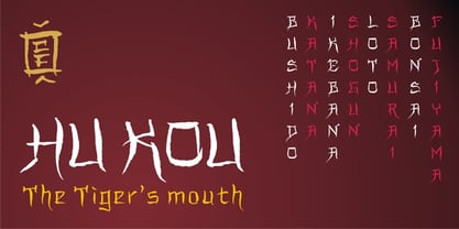

Page 1 of 250Next page